This is an issue I’ve been struggling with for a while, so it’s not so much as a “how-to” post as an invitation to discuss the subject.
The keen-eyed among you will have noticed that I’ve started watermarking my photos. (A watermark is, in this case, a small and mostly transparent addition to your image that shows the image is copyrighted, to deter unathorized use.) I’ve toyed with the idea of watermarking my images for years, but was too lazy to do it. Now that I run all my pix through Photoshop before I publish them, and thanks to this great tutorial from one of my 365 friends, I can drop a watermark into each image with three clicks.
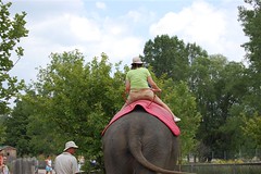
You can see it in this photo of the American falls at Niagara Falls (because I don’t have enough Niagara Falls in my blog this week, right?)
I really don’t want the watermark to interfere with the images, so I tucked it way down in the corner and tried to make it mostly transparent. (The problem with putting it way down in the corner is that it’s not too difficult to crop it out, should someone be so inclined, but the kind of people who steal images are generally the lazy sort anyway, and I suffer no delusions that my images are worth the extra effort to acquire!)
So that’s the ‘what’ of watermarking, and a hint at the ‘how,’ but what of the why?
I talked to Andrea a bit about this when we had lunch the other day, and it was great to finally talk to someone about it after stewing on it for weeks. I’ve been having a crisis of confidence about having so much of my world online and out in public lately. Part of it was the (albeit totally innocuous) recognition of Lucas and Beloved in the library by a nice lady who reads the blog and lives in my neighbourhood, but it was mostly motivated by some weird traffic in my Flickr stats.
You might remember back in the fall of 2007, there was a kerfuffle on the ‘net about people stealing images of kids and making fake profiles on the social networking site Orkut. About a month ago, I noticed that there was traffic from Orkut that pointed to a (completely ordinary) picture of Tristan from an apple-picking trip a couple of years ago. I made the image private, and that stopped the traffic, but there are still a few links from sites that Flickr doesn’t recognize pointing to random photos in my stream and if I can’t reconcile it I’m not comfortable with it.
For a while, I was so twitchy about the issue that I thought the solution might be to simply stop taking pictures of the boys for my 365. That idea made me feel sick, and sad, and a little angry. The whole reason I started Project 365 was to improve my photographic skills, and while it’s nice to be able to take better pictures of carrots and fence posts, what *really* matters to me is better pictures of the people I love. If I were to quit taking pictures of the kids, I might as well quit the 365 entirely.
I toyed for a while with making every image of family members private or for contacts only on Flickr (truth be told, I’m still thinking about it) but that certainly wouldn’t help with the images I post here. And it may be a little bit too late in any case, what with four and a half years worth of images already out there in cyberspace.
In the end, I’ve decided on a middle ground of cautious awareness. I think it’s prudent to be conscious of what you put on the Web but, thanks in part to the chat I had with Andrea, I’m feeling less exposed and freaked out about the whole thing. I’m taking simple steps to minimize any potential risks, like being cognizant of the kind of images I put up — no bare bums, stuff like that. I don’t post their pictures to any group that has “child” or “babies” or anything like that in it. And I monitor the traffic on Flickr much more carefully than I monitor my blog traffic. If anything makes me even remotely uncomfortable, I make the image private — so far, I’ve only done it twice.
Andrea asked me what it was that I would be worried about, what nefarious use of my images I feared, and I don’t know, exactly, what could be done. Frankly, I’d rather not think about it! But, as I’ve often said about living my life online, I’m not going to give undue attention to some ephermal and ill-defined potential risk.
And that comes back to watermarking. I’m going to watermark all my images, so I can protect in some small way the intellectual copyright on the few really stellar images that I’ve created, and to deter any unsavoury use of the images of with people in them.
What do you think of all this? Are you a purist who is annoyed by the ‘ego’ factor in watermarking photos? Do you think it’s futile to even bother? I’ve seen people argue that by simply putting images online, you are de facto giving up your rights to what happens to them — something I, no surprise, completely disagree with. What do you do to protect your images online? I’d love to hear your opinions on this!