When it comes to editing portraits, I tend to prefer a “clean edit” – tweaks for contrast, exposure, and vibrance (I love saturated colours!), but not too much more. Well, I also have a hopeless addiction to vignettes. But sometimes I see something that just cries out for a more artistic play, like this crate that was lying around in the apple orchard just begging me to take its photo.
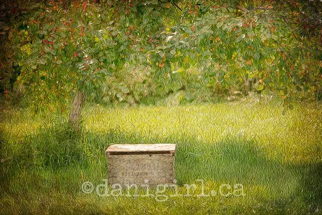
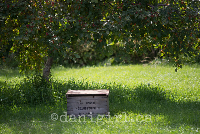
I’ll freely admit that I really went to town on this one. I used not one but two texture layers and the oil painting filter in Photoshop. It comes very close to what I wanted though – an impressionistic interpretation of the original image. Just for reference, here’s the *coughboringcough* clean edit before I started heaping layers on it.
I had to really pull down the contrast to make the apples stand out more, and then I used textures with lots of warm golden tones and a bit of edge burning for the vignette effect. I like it, but I’m not totally in love with this one. It’s still too much just a picture of a box to me – I think because the original photo wasn’t quite as strong as it could be. THAT’s a lesson I’ve learned over and over again — all the fancy digital editing in the world rarely helps a mediocre photo be anything more than mediocre. It’s still missing a little je ne sais quoi – but because it’s just a photo I was playing with for funsies, it’s good enough for sharing.
What do you think? Are you interested in the details of how to do stuff like this?
Totally interested! I love this kind of before and after stuff, and the more detail the better. I’m surprised that pulling down the contrast made the apples stand out – I have so much to learn, Obiwan :).
Love the final result, by the way!
I was going to call you MONET, but Lynn beat me to it with the Obiwan. can’t be both 🙂
p.s. love it!
Well, pulling down the contrast helped. In the original, there was that bright spot of grass and your eye is automatically drawn to bright areas (and human faces, for the record.) By toning down the contrast, it evens the difference between the bright and dark tones. Pulling up the deep shadows in the green tree is actually what helped pull the apples out. But it was all part of the same process.
And thanks! Oh dear, if you guys are really interested in this stuff, I may actually start blogging regularly again. I could spend all day playing in Photoshop and then describing the how and what and why of the play! 🙂