My brain has been a little bit too full this week, stuffed with insurance claims and residual values for the van, and with css and hex colours for the blog redesign, and with a million other silly little things. Thank goodness I’m on vacation as of this afternoon — I could really put those pesky eight to ten hours a day that work demands to better use! All that to say, the picture-taking hasn’t been my primary (wait for it!) focus this week. Har har har.
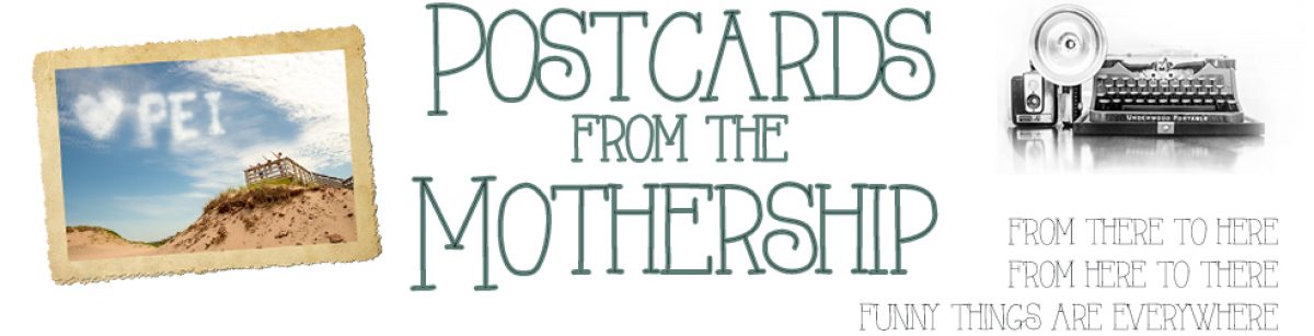
Ahem, anyway… I’ve been reading a steady stream of photography books, sucking up ideas, concepts and tips and filing them away in unoccupied nooks and crannies in my brain. I just finished the highly rated and highly recommended Learning to See Creatively by Bryan F. Peterson. He gives ideas like “Envision the world from the perspective of a leaf that’s just fallen off a tree.” I loved it! A really great book if you’re feeling a little stuck in the creativity department, with some stunning photography. Not your standard “to achieve minimum depth of field, use a focal length of…” tutorial. This picture was loosely inspired by that, imagining the perspective of a busy toddler at the park. Plus, I liked the purple of his shorts and hat with the lime green of his shirt!
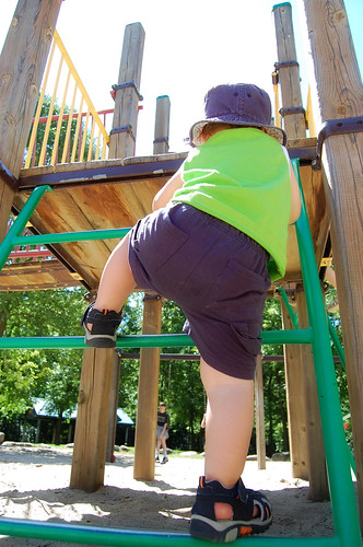
I love my daisies. I love bokeh. What could be better than bokeh daisies? (Bokeh – rhymes with mocha – is the character of the out-of-focus parts of your image. I’m going to put up a whole Family Photographer post on bokeh soon!) Anyway, I was really happy with how this turned out — watch for it to play a part in the fancy-schmancy new blog design to be revealed in the next week or so!
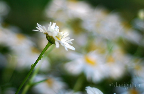
A few years back, they shut down the Stittsville Flea Market, and Sunday afternoons just haven’t been the same since. On our way out to retrieve our personal belongings from the van (sniff) we stopped at a little echo of the Stittsville flea market and poked around for a bit. Take a look at the bottom-right image — that is by far the largest pile of scissors I have ever seen. And the top-right image got a little bit cut off in the mosaic, but the base says “#1 Mom!” Isn’t she frightful horrid adorable?
On these busy days, I’m honing a new specialty: the 365-dinner combo!

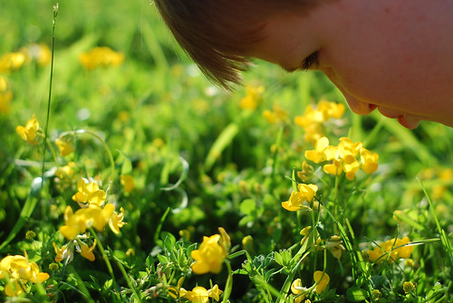
We were on our way home from swimming lessons and I was done like dinner, but I still didn’t have a decent picture. I don’t think I’d even put the viewfinder to my face that day… a new record for sure. On our way out of the sportsplex, I said to Tristan, “Go sniff those flowers.” Bless his little heart, he neither questioned me nor even cast a glance askew, he just patiently sniffed the flowers (don’ tell him they’re weeds!) while I took the picture. I do love my boys so…
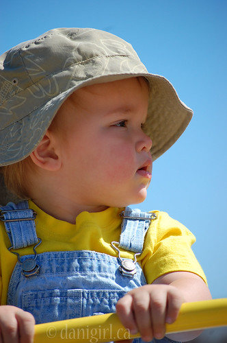
Although it has been a questionable summer at best, we lucked out on Wednesday morning with a glorious day of sunshine, perfect for a couple of hours at the park. I brought my telephoto lens and took almost 100 pictures, a few of which turned out rather well. I chose this one as the shot of the day because I liked the colours and the composition.

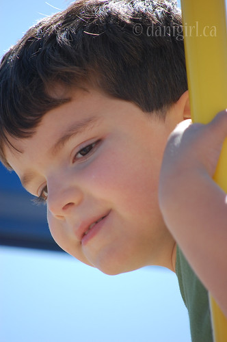
And, because I was out of the way and less obviously in their faces with my camera, I managed to get some nice portraits of each of the the boys at play.
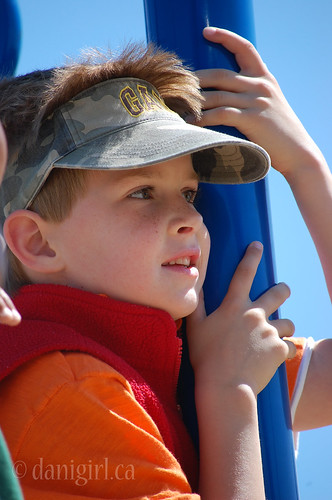
(Tristan is wearing a fleece vest in the summer sun because it makes him “look like a Pokémon trainer.” It’s hard to argue with that kind of logic.)
This last one is something a little different. It’s an abstract. Can you guess what it is? It caught my eye because of the contrasting blue and orange colours, and because of the really interesting texture. I shot this one with my telephoto lens, zoomed all the way out to 200mm for a close-up.

It’s the safety railing between levels in the parkade where I’ve parked at least two dozen times since I started the 365 project, possibly one of the nastiest places I go on a regular basis. I don’t know why I never noticed it before, but as soon as I pulled up and the headlight illuminated the corrosion on the railing I thought it would make an interesting picture. I wasn’t expecting the background to fade out to black because it was reasonably well-lit in there. In fact, I set up the shot so the red car down 1/2 level would be the out-of-focus background for the railing, giving even more colour constrast — or so I thought. I kind of like how it turned out, though.
And any day when you get your 365 picture in the can before 7 am is a good day!
Oh I’ve been dying to read that book! I’m jealous!
My favorite of the week has to be… the one with the pail and the sand. Something about the composition of the shot just gets me!