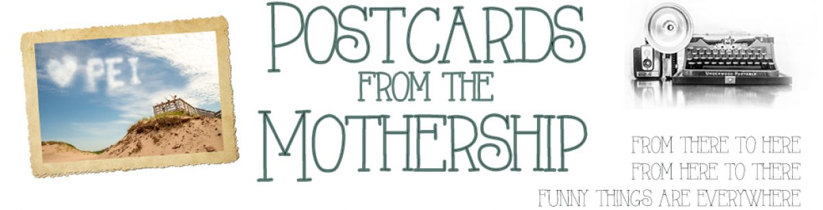
So???? What do you think? (If you’re reading through a feed reader, you MUST click through — I’ve done a massive blog reno.)
Mad props to Nikki at Design Coyote (and also at Snailbird.com) who managed to give me what I wanted instead of what I asked for.
I was originally going to upload the Evening Stars theme from her free themes page when, on a lark, I sent her a query on the cost of a custom design. She was very reasonable, both in the rate she charged and in tolerating endless requests for minute adjustments (“Oh, but what if we tried the font in this colour? And what if we moved this over here just 15 pixels or so…”) and after a bit of back-and-forth and a bit more tinkering on my part, I’m thrilled to present it to you!
It’s a big change, I know, but I really wanted something with two sidebars, something that was playful and yet not childish, something that was fluid width instead of fixed-width, and something that gave props to my 365 project. I think she did a great job!
Please do let me know if you have any trouble with the design or the pages loading. For some reason, my previous design started loading really slowly recently, so another one of my criteria was a faster load. And, on our desktop there’s a scrollbar across the bottom because the display is a little bit too wide, but I don’t have that on the laptop and it doesn’t seem to interfere with the display of any of the content. I’ve checked it in IE, Firefox and Safari.
So, really — what do you think????
Hee hee — well, I didn’t see this post before, but you already know what I think. Love it! It really is classy and fun at the same time.
It looks great! In fact, my husband who has never seen your blog just walked in and said, “That’s a nice design!” So I think it’s unanimous. 🙂
I like it!!!!!
It’s lovely.
Sweet!
Very nice indeed! Good for you, but where do you find the energy?
very nice!
Very nice! Fresh and clean.
Can I say two small things (I’m picky and like things to be perfect!)
1) The date icon at the top of your posts isn’t rendering very well in Explorer. The date number is spilling into the year, and that’s probably not meant to happen.
2) Personally I would make the sidebar text a shade smaller to make it stand out more from your main content. This is just a design thing and I realize it’s a minor bit of extra polish … but there it is!
Great job! I know how difficult it is to move to a new design.
Beautifull new template Danigirl! Beautiful! Congratulations!
I think I’ll contact this people!
Thanks all! Thanks especially for the constructive criticism, Andrea — just the kind of observations I’d like to hear! I’ll see what I can do about the date box; it was fine on my laptop at home but I’m getting the same effect you see here on this computer.
Also, there are supposed to be two sidebars all the way down, but on this computer the second sidebar has jumped down to the end of the first sidebar. The “Our kind sponsors” box is supposed to be up under the Flickr box, but I see it way down after the end of the post on a single page or the end of the inner sidebar on the main page. Anybody else getting that effect?
Guillermo, please do contact Nikki at DesignCoyote.com and tell her I sent you! 🙂
It’s beautiful. Nicely done. 🙂
Very nice! I love the font used in the banner!
Oh, I like it! I really love the banner – clean and simple, but playful too!
Looks great!
Pretty and fresh!
A sunny day on my computer thanks to your redesign. Love it!
Awesome!
I love the new design… great collaboration on everyone’s part! Eventually you will have to do a post on ‘blog through the years’… and show screen shots of how your blog has evolved through the years!
I think it looks great! It made me pause to check out the other blog templates. Food for thought.
So great! Very refreshing colours and easy to read, although your content speaks for itself in it’s awesomeness 😉
Nice! I like it 🙂